
Articles
How a New HTML Element Will Make the Web Faster
Posted on September 2, 2014
The Web is going to get faster in the very near future. And sadly, this is rare enough to be news.
The speed bump won’t be because our devices are getting faster, but they are. It won’t be because some giant company created something great, though they probably have. The Web will be getting faster very soon because a small group of developers saw a problem and decided to solve it for all of us.
That problem is images. As of August 2014, the size of the average page in the top 1,000 sites on the Web is 1.7MB. Images account for almost 1MB of that 1.7MB.
If you’ve got a nice fast fiber connection, that image payload isn’t such a big deal. But if you’re on a mobile network, that huge image payload is not just slowing you down, it’s using up your limited bandwidth. Depending on your mobile data plan, it may well be costing you money.
What makes that image payload doubly annoying when you’re using a mobile device is that you’re getting images intended for giant monitors loaded on a screen slightly bigger than your palm. It’s a waste of bandwidth delivering pixels most simply don’t need.
Web developers recognized this problem very early on in the growth of what was called the “mobile” Web back then. So more recently, a few of them banded together to do something developers have never done before—create a new HTML element.
In the beginning was the “mobile Web”
Browsing the Web on your phone hasn’t always been what it is today. Even browsing on the first iPhone, one of the first phones with a real Web browser, was still pretty terrible.
Browsing on a small screen back then required constant tapping to zoom in on content optimized for much larger screens. Images took forever to load over the iPhone’s slow EDGE network connection, and then there was all that Flash content. That didn’t load at all. And this was theiPhone; browsing the Web using Blackberry or other OSes crippled mobile browsers. It was distinctly worse.
It wasn’t necessarily the devices’ fault, though mobile browsers did, and in many cases still do, lag well behind their desktop brethren. Most of the problem was the fault of Web developers. The Web is inherently flexible, but developers confined it by optimizing sites for large desktop monitors.
To address this, a lot of sites started building a second site. It sounds crazy now, but just a few years ago the going solution for handling new devices like the Blackberry, the then-new iPhone, and some of the first Android phones was to use server-side device detection scripts and redirect users to a dedicated site for mobile devices, typically a URL like m.domain.com.
These dedicated mobile URLs—often referred to as M-dot sites—typically lacked many features found on their “real” desktop counterparts. Often, sites didn’t even redirect properly, leaving you on the homepage when you wanted a specific article.
M-dot websites are a fine example of developers encountering a problem and figuring out a way to make it even worse. Luckily for us, most Web developers did not jump on the M-dot bandwagon because something much better soon came along.
Responsive design killed the M-Dot star
In 2010, Web developer Ethan Marcotte wrote a little article about something he called Responsive Web Design.
Marcotte suggested that with the proliferation of mobile devices and the pain of building dedicated M-dot sites, it might make more sense to embrace the inherently fluid nature of the Web. Instead, he argued, let’s build websites that were flexible. Marcotte envisioned sites that used relative widths to fit any screen and worked well no matter what device was accessing it.
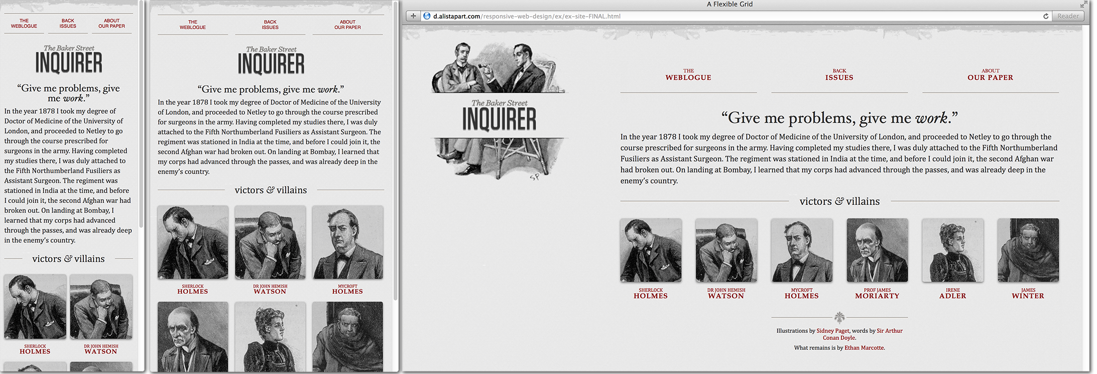
Marcotte’s vision gave developers a way to build sites that flex and rearrange their content based on the size and characteristics of the device in your hand. And while responsive Web design wasn’t perhaps a panacea, it was pretty close.
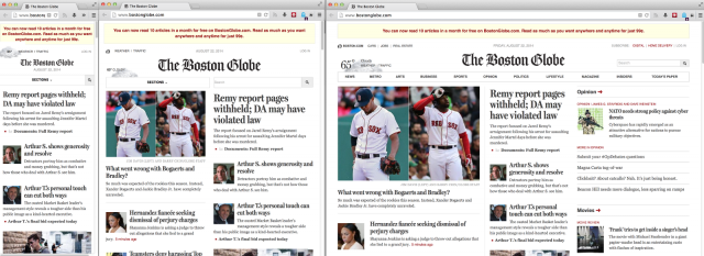
Responsive design started when a few more prominent developers made their personal sites responsive, but it quickly took off when Marcotte and the developers at the Filament Group redesigned the Boston Globe website to make it responsive. The Globe redesign showed that responsive design worked for more than developer portfolios and blogs. The Globe redesign showed that responsive design was the way of the future.
While the paper’s re-do was successful from a user standpoint, Marcotte and the Filament Group did run into some problems behind the scenes, particularly with images. Marcotte’s original article dealt with images by scaling them down using CSS. This made images fit smaller screens and preserve the layout of content, but it also meant mobile devices were loading huge images with no intention to ever be displayed at full resolution.
For the most part, this is still what happens on nearly every site you visit on a small screen. Web developers know, as the developers building the Globe site knew, that this is a problem. Yet, solving it is not as easy as it seems at first glance.
That dilemma is what led to today. Solving this image problem required adding a brand new element to HTML.
Introducing the picture element
The Picture element story begins with the developers working on the Boston Globe, including Mat Marquis, who would eventually co-author the HTML specification.
In the beginning, though, no one working on the project was thinking about creating new HTML elements. Marquis and the other developers just wanted to build a site that loaded faster on mobile devices.
As Marquis explains, they thought they had a solution. “We started with an image for mobile and then selectively enhanced it up from there. It was a hack using cookies and JavaScript. It worked up until about a week before the site launched.”
Around this time, both Firefox and Chrome were updating their prefetching capabilities, and the new image prefetching tools broke the method used on the Globe prototypes. Browser prefetching turned out to be more than just a problem for the original Globe solution; it’s actually the crux of what’s so difficult about responsive images.
When a server sends a page to your browser, the browser first downloads all the HTML on the page and then parses it. Or at least that’s what used to happen. Modern Web browsers attempt to speed up page load times by downloading images before parsing the page’s body. The browser starts downloading the image long before it knows where that image will be in the page layout or how big it will need to be.
This is simultaneously a very good thing—it means images load faster—and a very tricky thing. It means using JavaScript to manipulate images can actually slow down your page even when your JavaScript is trying to load smaller images (because you end up fighting the prefetcher and downloading two images).
Marquis and the rest of the developers working on the site had to scrap their original plan and go back to the drawing board. “We started trying to hash out some solution that we could use going forward… but nothing really materialized.” However, they started writing about the problem, and other developers joined the conversation. They quickly learned they were not alone in struggling with responsive images.
“By this time,” Marquis says, “we have 10 or 15 developers, and nobody has come up with anything.”
The Globe site ended up launched with no solution. Mobile devices were stuck downloading huge images.
Soon other prominent developers outside the Globe project started to weigh in with solutions, including Google’s Paul Irish and Opera’s Bruce Lawson. But no one was able to craft a solution that covered all the possible use cases developers identified.
“We soon realized,” says Marquis, “that, even if we were able to solve this with a clever bit of JavaScript, we would be working around browser-level optimizations rather than working with them.” In other words, using JavaScript meant fighting the browser’s built-in image prefetching.
Talk soon moved to lower-level solutions, including a new HTML element that might somehow get around the image prefetching problems in a way that JavaScript never would. It was Bruce Lawson of Opera who first suggested that a new <picture> element might be in order. Though they did not know it at the time, a picture element had been proposed once before, but it never went anywhere.
Welcome to the standards jungle (we’ve got fun and games)
It is one thing to decide a new HTML element is needed. It’s quite another thing to actually navigate the stratified, labyrinthine world of Web standards—especially if no one on your team has ever done such a thing.
Perhaps the best thing about being naive, though, is that you tend to plow forward without the hesitation that attends someone who knows how difficult the road ahead will be. And so the developers working on the picture element took their ideas to the WHATWG, one of two groups that oversees the development of HTML. The WHATWG is made up primarily of browser vendors, which makes it a good place to gauge how likely it is that browsers will ship your ideas.
To paraphrase Tolstoy, every standards body is unhappy in its own way. As Marquis was about to learn, the WHATWG is perhaps most unhappy when people outside it make suggestions about what it ought to do. Suffice to say, Marquis and the rest of the developers involved did not get the WHATWG interested in a new HTML element.
Right around this time, the W3C—which is where the second group that oversees HTML, the HTML WG, is based—launched a new idea called “community groups.” Community groups are the W3C’s attempt to get outsiders involved in the standards process, a place to propose problems and work on solutions.
After being shot down by the WHATWG, someone suggested that the developers start a community group. The Responsive Images Community Group (RICG) was born.

The only problem with community groups is that no one in the actual working groups pays any attention to community groups. Or, at least, they didn’t in 2011.
Blissfully unaware of this, Marquis and hundreds of other developers hashed out a responsive image solution in the community group.
Much of that effort was thanks to Marcos Caceres, now at Mozilla. Unlike the rest of the group members, Caceres had some experience with writing Web standards. That experience allowed him to span the divide between two worlds—Web development and standards development. Caceres organized the RICG’s efforts and helped the group produce the kind of use cases and tests that standards bodies are looking for. As Marquis puts it, “Marcos saw us flailing around in IRC and helped get everything organized.”
“I tried to herd all the cats,” Caceres jokes. And herd he did. He set up the Github repos to get everything in one place, set up a space for the responsive images site, and helped bring everything together into the first use cases document. “This played a really critical role for me and for the community,” says Caceres. “It forced us to articulate what the actual problem was… and to set priorities.”
After months of effort, the RICG brought its ideas to the WHATWG IRC. This also did not go well. As Caceres puts it, “standards bodies like to say ‘oh, we want a lot of input for developers,’ but then when developers come it ends in tears. Or it used to.”
If you read the WHATWG IRC logs from that time, you’ll see that the WHATWG members fall into a classic “not invented here” trap. Not only did they reject the input from developers, they turned around and, without considering the RICG’s work at all, proposed their own solution. It was something called set, an attribute that solved only one of the many use cases Marquis and company had already identified.
Developers were, understandably, miffed.
With developers pushing Picture, and browser makers and standards bodies favoring the far more limited and very confusing (albeit still useful) set proposal, it looked like nothing would ever actually come of the RICG’s work.
As Paul Irish put it in the WHATWG IRC channel, “[Marquis] corralled and led a group of the best mobile Web developers, created a CG, isolated a solution (from many), fought for and won consensus within the group, wrote a draft spec, and proposed it. Basically he’s done the thing standards folks really want ‘authors’ to do. Which is why this feels so defeating.”
Irish was not alone. The developer outcry surrounding the WHATWG’s counter proposal was quite vocal, vocal enough that some entirely new proposals surfaced. But browser makers failed to agree on anything. Mozilla killed the WHATWG’s idea of set on img. And Chrome refused to implement Picture as it was defined at the time.
If this all sounds like a bad soap opera, well, it was. This process is, believe it or not, how the Web you’re using right now gets made.
Invented here
To the credit of the WHATWG, the group eventually overcame their not-invented-here syndrome. Or at least partially overcame it.
Compromises started to happen. The RICG rolled support for many of the ideas inset into their proposal. That wasn’t enough to convince the WHATWG, but it got some members working together with the Marquis and the RICG. The WHATWG still didn’t like Picture, but they didn’t outright reject it anymore, either.
To an outsider, the revision process looks a bit like a game of Ping Pong, except that every time someone hits the ball it changes shape.
The big breakthrough for Picture came from Opera’s Simon Pieters and Apple’s Tab Atkins. They made a simple, but powerful, suggestion—make Picture a wrapper for img. That way there would not be two separate elements for images on the Web (which was rightly considered confusing), but there would still be a new way to control which image the browser displays.
This is exactly the approach used in the final version of the Picture spec.
When the browser encounters a Picture element, it first evaluates any rules that the Web developer might specify. (Opera’s developer site has a good article on all the possibilities Picture offers.) Then, after evaluating the various rules, the browser picks the best image based on its own criteria. This is another nice feature since the browser’s criteria can include your settings. For example, future browsers might offer an option to stop high-res images from loading over 3G, regardless of what any Picture element on the page might say. Once the browser knows which image is the best choice, it actually loads and displays that image in a good old img element.
This solves two big problems. With the browser prefetching problem, prefetching still works and there’s no performance penalty. And for the problem of what to do when the browser doesn’t understand picture, now it falls back to whatever is in the img tag.
In the final proposal, what happens is Picture wraps an img tag. If the browser is too old to know what to make of a <picture> element, then it loads the fallback img tag. All the accessibility benefits remain since the alt attribute is still on the img element.
Everyone is happy, and the Web wins.
Nice theory, but show me the browser
The Web only wins if browsers actually support a proposed standard. And at this time last year, no browser on the Web supported Picture.
While Firefox and Chrome both committed to supporting it, it might be years before it became a priority for either. Picture was little more than a nice theory.
Enter Yoav Weiss, a rare developer who spans the worlds of Web development and C++ development. Weiss was an independent contractor who wanted Picture to become a part of the Web. Weiss knew C++, the language most browsers are written in, but he never worked on a Web browser before.
Still, like Caceres, Weiss was able to bridge a gap, in this case the world of Web developers and C++ developers. He was in a unique position to be able to know what Picture needed to do and how to make it happen. After talking it over with other Chromium developers, Weiss started hacking on Blink, the rendering engine that powers Google’s Chrome browser.
Implementing Picture was no small task. “Getting Picture into Blink required some infrastructure that wasn’t there,” says Weiss. “I had two options: either wait for the infrastructure to happen naturally over the course of the next two years, or make it happen myself.”
Weiss—who, incidentally, has three young children and presumably not much in the way of free time—quickly realized that working nights and weekends wasn’t going to cut it. Weiss needed to turn his work on Picture into a contract job. So he, Marquis, and others involved in the community group set up a crowd funding campaign on Indiegogo.
On the face of it, it sounds like a doomed proposition. Why would developers fund a feature that will ultimately end up in a Web browser they otherwise have no control over? But something amazing happened. The campaign didn’t just meet its goal, it went way over it. Web developers wanted Picture bad enough to spend their money on the cause.
It could have been the T-shirts. It could have been the novelty of it. Or it could have been that Web developers saw how important a solution to the image problem was in a way that the browser makers and standards bodies didn’t. Most likely it was some combination of all these and more.
Enough money was raised to not only implement Picture in Blink, but to also port Weiss’ work back to WebKit so WebKit browsers (including Apple’s iOS version of Safari) can use it as well. At the same time, Caceres started work at Mozilla and helped drive Firefox’s support for Picture.
As of today, the Picture element will be available in Chrome and Firefox by the end of the year. It’s available now in Chrome’s dev channel and Firefox 34+ (in Firefox you’ll need to enable it inabout:config). Here’s a test page showing the new Picture element in action.
Apple appears to be adding support to Safari through the backport to WebKit, though it wasn’t finished in time for the upcoming Safari 8. Microsoft has likewise been supportive and is considering Picture for the next release of IE.
The future of the Web
The story of the Picture element isn’t just an interesting tale of Web developers working together to make the Web a better place. It’s also a glimpse at the future. The separation between those who build the Web and those who create Web standards is disappearing. The W3C’s community groups are growing, and sites like Move the Web Forward aim to help bridge the gap between developer ideas and standards bodies.
There’s even a site devoted to what it calls “specifiction”—giving Web developers a place to suggest tools they need, discuss possible solutions, and then find the relevant W3C working group to make it happen.
Picture may be almost finished, but the RICG isn’t going away. In fact, it’s renaming itself and taking on a new project—Element Queries. Coming soon to a browser near you.
Read more at http://arstechnica.com/information-technology/2014/09/how-a-new-html-element-will-make-the-web-faster/