
Articles
5 Ways to Design Your Site For Conversions
Posted on October 21, 2014
Website design is more than just putting together a snazzy new layout, or impressing people with your animation skills. A great website not only inspires, but also evokes trust and interest from a targeted audience. In fact, great designing is about conversions. That only happens when you have the right elements in your website.
5 Elements to Design Your Site for Conversions
1. Subliminal Suggestions
Have you looked closely at the Tostitos® tortilla chip logo? You have seen it for decades in stores. However, when was the last time you really stared at the logo long and hard?
Look at the Tostitos® logo below, and you will notice the logo shows two people eating tortilla chips. Mind…Blown! The company is essentially showing us how good it would be to eat the chips in the logo. While it is a bit obvious when you know what to look for, most people subconsciously see the tortillas chips and never think twice.
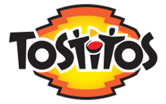
However, little subliminal tricks like these work if they are gentle suggestions. Before every small business owner goes out looking for subliminal tricks to use on their website, remember that the best ones are helpful things you do for people that they remember and want to reciprocate.
For example, putting testimonials on your site means the client is on a trusted site. Alternatively, you can use social media for social proof of the site’s popularity. Use your powers for good, and you will be shocked at the positive response.
2. Limit Choices
Do not overwhelm clients with choice. While many people consider Google to be a plain website in terms of design, you are never confused what they want you to do next.
Take their cloud services. Google has four levels of support for their cloud services. They have Bronze, Silver, Gold, and Platinum. Each level comes with additional support. Google lays the pricing structure out accordingly, so it is clear on the value you receive from the services.
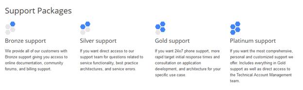
While some might not find the exact support they want, many more clients will find a great cloud platform to use on the site. With these four options, they are providing a clear program that will work for the vast majority of their clients.
3. Direct Attention with Images to Your Product
We mentioned this earlier, but this bears repeating. Images are not the pretty things you put on a website. Images give the website content and give the structure a good flow.
For example, take this image from Old Navy’s website.
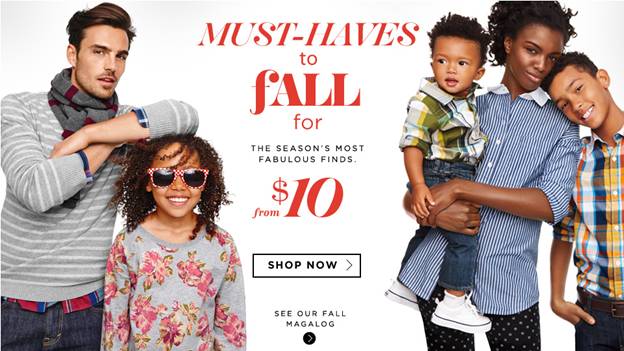
Look at the guys’ elbow in the photo. His elbow is pointing directly at the fall Must-Haves. Notice the little boy’s eyes on the other side of the picture. He is staring at the same words.
Both sides are subconsciously saying that Old Navy has some awesome Must-Haves that you need to check out for fall.
4. Call to Action
What are the best call to actions? With so many different variations, it is not possible to give you one call to action that works best in every situation. Therefore, below we have three amazing call to actions for different companies that work for their websites. Determine which call to action would work best for your website.
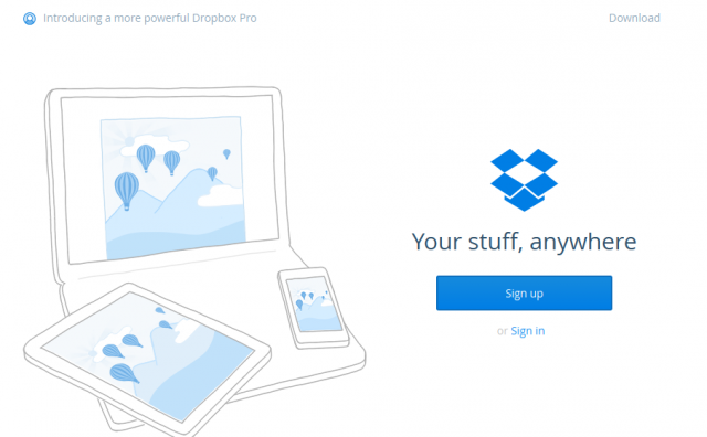
First, Dropbox’s call to action is simple, and yet compelling. Access your stuff on any device you use wherever you are in the world. Even the images in the devices show the same image with the balloons flying up in the mountains. It is powerful and simple. In addition, the blue Sign Up button is very prominent.
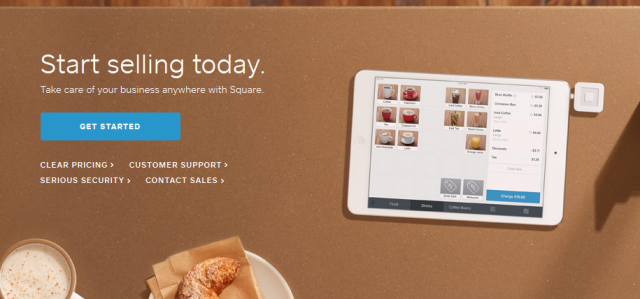
Second, Square does a great job of not only convincing business owners to get started, but also the image shows the power of their product. This CTA shows how a restaurant or café owner uses Square to process credit cards. The iPad with the square reader is very visible to the right, and the Get Started blue button sticks out from the brown background.
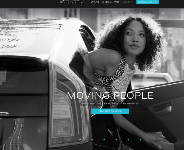
Third, Uber has a great call to action. They are emotionally pulling you in their images in the sliding carousel on the home page. For example, Moving people shows a woman getting safely out of a car. Each images shows how Uber helps people feel when using their driver share program.
5. Usability
Your site usability is a huge component of great web design. However, this affects conversions as well.
Take Expedia, for example. They were able to increase sales $12 million overnight by doing one thing: removing one field from their purchasing forms.
The travel site included a company name field in their checkout. Many consumers were confused, and filled out their bank or employers name. Then when they filled out the address, they would use the bank or employer address. Expedia does an address verification that would then fail, because it did not match up with their home address.
Many potential clients left the site in confusion. By removing this unnecessary field, they increased their revenue by $12 million and reduced confusion among millions of travelers.
Final Points on Designing Your Site for Conversions
Remember that designing your site for conversions is about making it easier on your visitors to use your products. Do not be fancy and make them take unnecessary steps. Instead, keep to the basics, and you will find more clients looking to learn about your services. What is your favorite secret about increasing conversions through good website design? Let us know in the comment section below.
Read more at http://tech.co/5-ways-design-site-conversions-2014-10